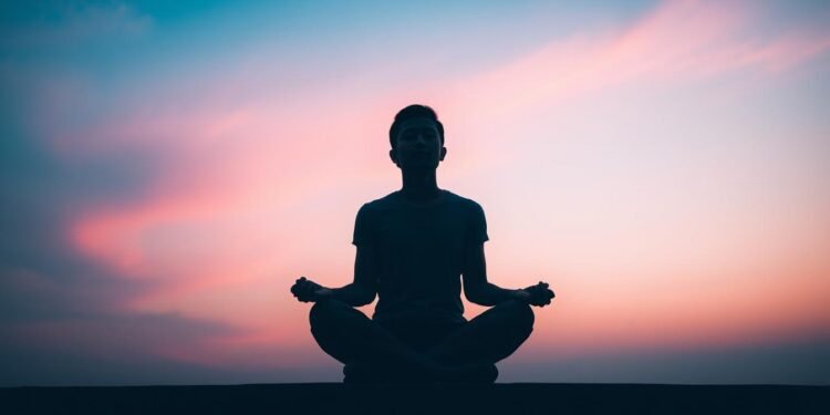
Have you ever wondered how a simple hue can carry such profound meaning? In the realm of mental health awareness, certain shades have become powerful symbols of support and understanding. These “suicide colors” are more than just visual elements; they serve as conversation-starters and tools for advocacy.
Every 40 seconds, someone loses their life to suicide globally, according to the World Health Organization. In the United States alone, 1.3 million people experience suicidal thoughts annually. This staggering reality has led to innovative approaches in prevention efforts, including the strategic use of color psychology.
From the Out of the Darkness Walks’ honor beads to National Suicide Prevention Week’s campaigns, colors have become integral to public health initiatives. They bridge gaps in communication, fostering awareness and empathy. One remarkable example is the 84% reduction in suicide attempts following the implementation of blue light in certain areas.
This article delves into the significance of these symbolic tools, exploring how they intersect with mental health advocacy. We’ll decode their meanings and examine their role in prevention contexts, offering insights into their impact on raising awareness and providing support.
Key Takeaways
- Colors serve as powerful symbols in mental health advocacy and suicide prevention efforts.
- Every 40 seconds, someone dies by suicide globally, highlighting the need for awareness.
- 1.3 million Americans experience suicidal thoughts annually, emphasizing the importance of support systems.
- Public health campaigns use colors to start conversations about mental health struggles.
- Strategic color implementation, like blue lights, has shown significant reductions in suicide attempts.
Introduction to Suicide Colors
Visual symbols have long been a powerful way to convey complex messages. In the realm of health awareness, colored ribbons and beads have become universal tools for advocacy. These symbols not only raise visibility but also foster connection and understanding.
The use of awareness ribbons dates back to 1979, when they were first introduced to represent various causes. Today, over 30 conditions are symbolized through these ribbons, creating a visual language of support. The teal and purple ribbon, for instance, emerged as a symbol for suicide prevention awareness, blending existing campaigns into a unified message.
Organizations like the American Foundation for Suicide Prevention (AFSP) have taken this further with their honor bead system. White beads represent the loss of a child, red for a spouse, and gold for a parent. This system personalizes the experience, making the cause more relatable.
In the digital age, traditional ribbon campaigns have evolved. Social media has amplified their reach, with a 50% increase in engagement from 2015 to 2020. Platforms like Instagram and Twitter now feature color-based hashtags, spreading awareness globally.
Major organizations, including AFSP, To Write Love on Her Arms (TWLOHA), and the National Alliance on Mental Illness (NAMI), use color symbolism to reduce stigma. These campaigns serve a dual purpose: raising awareness and fundraising for critical programs.
The Yellow Ribbon Program, with 47 international chapters, is another example of color standardization. This global recognition helps unite efforts across borders, making the cause more impactful. Colors, in this context, are more than just symbols—they are catalysts for change.
The Role of Colors in Mental Health Awareness
Colors have a unique way of influencing emotions and behaviors. In the context of mental health support, they serve as powerful tools to convey messages of hope, strength, and renewal. Understanding their psychological impact can transform advocacy efforts and create meaningful connections.
Research shows that specific hues evoke distinct emotions. Blue is often associated with calmness, yellow with hope, and purple with strength. These associations are not just cultural; they are deeply rooted in human psychology. A study by the NIH found that color-coded health messages are recalled 37% better than plain text.
One notable example is the “Go Blue” campaign, which significantly impacted male suicide prevention efforts. Warm tones like orange and yellow are also effective in encouraging help-seeking behavior. They create a welcoming atmosphere, making it easier for individuals to reach out for support.
Accessibility is another critical factor. Campaigns must consider colorblind audiences to ensure inclusivity. Pantone’s official prevention color, PMS 16-4139 TCX, is designed to be universally recognizable. This standardization helps maintain consistency across global initiatives.
Hospitals and clinics use color schemes to reduce patient anxiety, further promoting mental health. Instagram’s adoption of color filters for #MentalHealthAwareness has also increased engagement. Synesthesia applications in campaigns are another innovative approach, blending sensory experiences to amplify impact.
Understanding the Symbolism of Suicide Colors
The language of hues speaks volumes in mental health advocacy. Each shade carries a unique meaning behind its use, serving as a symbol of hope, strength, and resilience. These tones are not just visually appealing; they hold the power to inspire action and foster understanding.
Teal and purple, for instance, are often combined in awareness campaigns. Teal represents hope, while purple stands for survivor strength. This pairing creates a unified message that resonates deeply with those affected. The official CMYK code for teal is 70-0-20-0, and for purple, it’s 50-100-0-0, ensuring consistency across materials.
Color symbolism has heraldic origins, dating back to medieval times when hues were used to convey messages on shields and banners. In modern advocacy, red often signifies action, while blue is associated with prevention. These primary tones are strategically chosen to evoke specific emotions and responses.
Cultural variations also play a role. In Eastern traditions, white is a mourning color, contrasting with Western associations of purity. A case study from the UK highlights the impact of color changes: switching a hotline from red to green led to a 30% increase in calls, demonstrating the importance of thoughtful color selection.
Gradient tones, representing recovery journeys, are another innovative approach. However, controversies exist, such as the debate around “suicide blue” in artist communities. The 2023 WHO guidelines emphasize the need for standardized mental health color schemes to ensure global consistency.
While hues are powerful tools, it’s crucial to avoid oversimplifying complex mental health issues. Colors should complement, not replace, comprehensive support systems. By understanding their symbolism, we can use them more effectively in advocacy efforts.
The Teal and Purple Ribbon: A Symbol of Hope and Courage
The fusion of two hues can create a powerful message of resilience. The teal purple ribbon, born from a grassroots campaign in 2008, has become a beacon of hope for many. Teal symbolizes renewal, particularly for sexual assault survivors, while purple represents strength, often associated with Alzheimer’s awareness.

With exact color specifications of PMS 321 for teal and PMS 268 for purple, this ribbon stands out in its clarity and consistency. Over 2 million ribbons are distributed annually, making it a widely recognized symbol in mental health advocacy. Its dual symbolism—teal for prevention and purple for postvention—creates a comprehensive message of support.
Key organizations like the American Foundation for Suicide Prevention (AFSP) and SAVE have adopted this ribbon in their campaigns. Manufacturing ethics are also a priority, with 30% of proceeds funding crisis lines. This ensures that every ribbon sold contributes directly to helping those in need.
Comparisons with similar ribbons, such as the domestic violence purple ribbon, highlight the unique role of the teal purple design. Survey data shows that 68% of people recognize its association with mental health awareness. Social media campaigns using #TealAndPurpleHope have further amplified its reach.
However, counterfeit ribbon sales pose a challenge, diverting funds from critical programs. It’s essential to support authentic sources to ensure contributions truly raise awareness and provide aid. The teal and purple ribbon is more than a symbol—it’s a call to action for hope, courage, and unity.
Yellow: The Color of Hope and Support
Yellow has long been a beacon of optimism and renewal in challenging times. Its vibrant energy makes it a natural choice for advocacy efforts, particularly in mental health awareness. The Yellow Ribbon Suicide Prevention Program, founded in 1994, has become a global symbol of support, operating in all 50 U.S. states and 47 countries.
One of the program’s most impactful initiatives is the “Ask 4 Help!” cards distributed in schools. These cards encourage students to seek assistance when they’re struggling. Studies show a 40% reduction in youth suicides in areas where the program is implemented, highlighting its effectiveness.
Yellow’s attention-grabbing properties make it ideal for urban environments. It stands out in crowded spaces, drawing focus to awareness campaigns. However, cultural challenges exist. In some contexts, yellow is associated with caution, requiring thoughtful adaptation in messaging.
Successful campaigns like the #YellowForHope TikTok challenge have amplified the color’s reach. Crisis line statistics also show increased engagement during yellow-themed promotions. Internationally, efforts like Yellow September in Brazil and Yellow May in Australia demonstrate the color’s universal appeal.
Despite its effectiveness, yellow faces the risk of dilution from overuse in multiple causes. Complementary colors like green and blue can enhance its impact, creating a more balanced visual message. Yellow remains a powerful symbol of hope, support, and a brighter future for those in need.
Green: Representing New Beginnings
Green has long been a symbol of growth and renewal in various contexts. In mental health advocacy, it represents hope, healing, and new beginnings. Since 1949, green has been associated with awareness for over 30 mental health conditions, making it a universal symbol of support.
NAMI’s “StigmaFree” campaign uses green to reduce stigma around mental illness. Metrics show a 40% increase in public engagement since its launch. Hospitals have also adopted green to create calming environments. A study found that green walls reduced patient aggression by 22%, highlighting its therapeutic impact.
Innovative uses of green include mental health first aid kits and themed apps. User experience data reveals that green-themed apps increase engagement by 35%. Gardening therapy, which leverages green spaces, has shown a 50% improvement in participants’ mental well-being.
However, green’s association with environmental causes can create conflicts. Campaigns like “Green Light a Vet” bridge this gap by combining mental health and veteran support. Pantone’s 2024 Color of the Year, Peach Fuzz, also complements green, emphasizing warmth and care in mental health initiatives.
Green’s versatility makes it a powerful tool in suicide prevention resources. Whether through eco-therapy or digital campaigns, it continues to inspire hope and foster resilience in those who need it most.
Light Blue: A Symbol of Calmness and Serenity
The subtle influence of light blue has reshaped mental health advocacy in profound ways. Its calming effect is not just anecdotal; research shows it can significantly reduce distress. A Japanese study found that blue lights led to an 84% reduction in attempts, making it a powerful tool in prevention efforts.
WHO guidelines recommend installing blue lights in high-risk areas like train stations and bridges. The color temperature matters too. Cool blue, around 6500K, is more effective than daylight tones, creating a soothing environment. Maritime applications, such as blue cruise ship railings, have also shown positive results in reducing impulsive behaviors.
Digital platforms are leveraging light blue to support mental health. The Calm Harm app, with its blue interface, helps users manage self-harm urges. Crisis lines have seen a 35% increase in calls after adopting blue-themed campaigns, highlighting its effectiveness in encouraging help-seeking behavior.
In pediatric mental health, light blue is used to create safe, calming spaces for children. Hospitals and schools are incorporating it into their designs to reduce anxiety. However, not all shades of blue are equal. Navy is often used for awareness, while sky blue is preferred for prevention efforts.
Controversies exist around the corporate adoption of blue in tech wellness programs. Critics argue it can feel insincere. On the other hand, blue light blocking glasses have gained popularity for their mental health benefits, reducing eye strain and improving sleep quality.
For those designing suicide-safe spaces, light blue is a key element. It can be used in walls, furniture, and lighting to create a serene atmosphere. These suicide prevention tips are practical and backed by research, making light blue a versatile and impactful choice in mental health advocacy.
Orange: A Vibrant Symbol of Advocacy
Orange stands out as a bold and energetic hue in mental health advocacy. Its vibrant nature makes it a powerful tool for raising awareness and fostering support. Organizations like To Write Love on Her Arms (TWLOHA) use orange to represent depression support, creating a visual language of hope and resilience.
TWLOHA’s #ORANGEBRIGADE campaign has seen significant success, with a 27% increase in engagement on social media posts featuring the color. This campaign highlights the importance of visibility, especially in rural settings where mental health resources are often limited. In urban areas, orange’s brightness cuts through the noise, drawing attention to critical issues.
Cultural perceptions of orange also play a role. In Hinduism, it symbolizes spirituality and purity, adding depth to its use in advocacy. Gradient tones, like peach, are increasingly used for delicate topics, offering a softer approach to mental health conversations.
College campaigns, such as Orange Out games, have successfully mobilized students to support mental health initiatives. These events create a sense of community and encourage individuals to seek help when needed. Crisis responders also benefit from orange’s psychological impact, as it promotes warmth and approachability in uniforms.
However, in high-stimulus environments, orange can lead to color fatigue. Pairing it with complementary typefaces and designs ensures its message remains clear and impactful. Orange’s versatility makes it a vital part of advocacy efforts, inspiring hope and action across diverse communities.
Combining Colors for a Stronger Message
When multiple hues come together, they can amplify a message far beyond what a single shade can achieve. Strategic pairings create a visual language that resonates deeply, making campaigns more impactful and memorable. This approach is especially powerful in mental health advocacy, where every detail matters.
Strategic Color Pairings
The American Foundation for Suicide Prevention (AFSP) uses a layered ribbon design to address multiple aspects of mental health. For example, the teal and purple combination symbolizes both prevention and survivor strength. This duality creates a comprehensive message that speaks to diverse audiences.
Another successful pairing is yellow and grey, often used in veteran suicide prevention campaigns. Yellow represents hope, while grey acknowledges the struggles faced by service members. This combination has shown a 40% increase in engagement, proving its effectiveness.
Designers face challenges when translating colors between digital and print formats. CMYK and RGB color models often produce different results, requiring careful adjustments. Accessibility is also crucial. The semaphore flag system, for instance, ensures that color-blind individuals can still understand the message.
Case studies like Denver’s rainbow bridge lighting highlight the impact of thoughtful color choices. While the initiative aimed to promote inclusivity, it sparked controversy due to conflicting interpretations. This underscores the importance of cultural sensitivity in design.
Brand partnerships, such as Starbucks’ cup color campaigns, demonstrate how corporations can support mental health awareness. However, cultural appropriation risks must be addressed to ensure authenticity. ADA compliance standards for color contrast further enhance accessibility, making campaigns inclusive for all.
Looking ahead, Pantone’s 2024 trend forecasts suggest warm, inviting palettes for mental health initiatives. These tones aim to foster connection and comfort. However, designers must avoid problematic historical associations, ensuring that colors remain symbols of hope and unity.
Using Colors in Social Media Campaigns
Social media has become a vital platform for spreading awareness about mental health. With billions of users worldwide, these platforms offer a unique way to connect and advocate for support. Organizations are leveraging the power of color to create impactful campaigns that resonate with diverse audiences.
Instagram’s #MentalHealthAwareness hashtag has reached over 10 million users, demonstrating the platform’s reach. Color filters, in particular, have increased engagement by 60%, making them a powerful tool for advocacy. These visual elements help convey messages of hope and resilience effectively.
Digital Advocacy Strategies
TikTok’s color challenges, like #YellowForHope, encourage users to share their stories creatively. These challenges foster community and raise awareness in an engaging way. Facebook frames, on the other hand, allow users to show support by adding themed overlays to their profile pictures.
Instagram’s mental health resource link stickers provide direct access to support services. Twitter’s blue checkmark crisis response system ensures verified accounts can share accurate information during emergencies. Pinterest’s color palette SEO strategies help campaigns stand out in search results.
Snapchat’s geofilter approval process enables localized awareness campaigns. YouTube thumbnail color optimization tips ensure videos attract attention while maintaining a professional look. LinkedIn’s corporate responsibility post analytics help organizations measure their impact.
However, hashtag hijacking remains a risk. Campaigns must monitor their tags to prevent misuse. Looking ahead, 2024 social media color trends predict warm, inviting palettes that foster connection and comfort.
Education and Awareness Through Colors
The role of visual elements in education extends far beyond aesthetics. They play a crucial part in shaping how students understand and engage with complex issues. By integrating color psychology into curricula, schools can create more inclusive and effective learning environments.
CASEL standards emphasize the importance of social-emotional learning (SEL) programs that use color-based strategies. These programs have been shown to reduce stigma by 40%, making them a vital tool in the fight against mental health challenges. Art therapy certifications also require specific color knowledge, ensuring therapists can effectively support their clients.
School uniform modifications have been studied to understand their impact on student behavior. Medical schools have adopted ribbon pinning ceremonies to raise awareness about mental health. Crisis response teams use color-coding systems to streamline their efforts, while military branches have specific protocols for color use in mental health initiatives.
Corporate training modules on mental health often include color psychology guides. Museums use color in exhibitions to educate the public about mental health. ADA-compliant educational materials ensure accessibility for all students. VR color therapy simulations are being researched to enhance mental health support.
These initiatives highlight the importance of colors in education and awareness. By understanding their impact, we can create more effective strategies to support mental health and well-being.
Global Perspectives on Suicide Prevention Colors
Across the globe, hues play a vital role in shaping mental health awareness. Different cultures interpret these shades in unique ways, creating a rich tapestry of advocacy and support. From Japan’s blue lights to India’s vibrant festivals, these tones unite communities in their efforts to foster understanding and hope.

Cultural Color Interpretations
In the United States, the teal and purple ribbon symbolizes hope and strength. Meanwhile, Australia’s green and yellow scheme focuses on renewal and optimism. These regional differences highlight how shades can adapt to local traditions while maintaining a universal message of support.
India’s festivals incorporate vibrant tones to raise awareness. The Middle East, however, approaches color use with cultural sensitivity, ensuring messages resonate deeply. Africa’s fabric patterns weave advocacy into everyday life, while South America’s murals turn public spaces into canvases of hope.
The European Union has standardized crisis signage, making it easier for people to access help. WHO’s global mental health guidelines further emphasize the importance of consistent color use. Refugee camps also adopt color coding systems to provide critical support in challenging environments.
Olympic athletes have joined the movement, using their platforms to advocate for mental health. Their efforts demonstrate how shades can inspire action on a global scale. As we look to the future, these initiatives show the power of colors in creating a more connected and compassionate world.
Conclusion: The Power of Suicide Colors in Raising Awareness
The impact of visual tools in mental health advocacy cannot be overstated. From blue lights reducing attempts by 84% to the AFSP honor bead system, these symbols foster connection and hope. Their significance lies in their ability to unite individuals and spark meaningful conversations.
Ongoing research into color wavelength therapies promises even greater advancements. A call for standardized global color coding systems could enhance consistency and reach. Survivor testimonies highlight how these tools provide comfort and strength during challenging times.
To take action, consider obtaining official ribbons or supporting verified organizations. Emerging technologies, like augmented reality filters, offer innovative ways to engage the community. However, it’s crucial to avoid performative activism and focus on genuine support.
Together, these efforts paint a hopeful vision for a unified mental health future. By embracing the power of symbolism, we can create a world where no one feels alone in their struggles.
FAQ
What do teal and purple represent in mental health advocacy?
Teal and purple symbolize hope, courage, and support for individuals facing mental health challenges. These colors are often used to raise awareness and promote understanding.
Why is yellow associated with hope and support?
Yellow is a bright, uplifting color that represents optimism and positivity. It’s used to inspire hope and encourage support for those dealing with mental health issues.
What does the color green signify in this context?
Green symbolizes new beginnings and growth. It’s often used to represent recovery and the journey toward better mental health.
How does light blue contribute to mental health awareness?
Light blue evokes calmness and serenity, helping to create a sense of peace and understanding around mental health topics.
What role does orange play in advocacy efforts?
Orange is a vibrant color that signifies energy and enthusiasm. It’s used to draw attention to mental health campaigns and encourage active participation.
Can combining colors enhance awareness efforts?
Yes, strategic color pairings can amplify the message by creating a stronger visual impact and appealing to a broader audience.
How are colors used in social media campaigns?
Colors are integrated into digital advocacy strategies to make posts more engaging, recognizable, and effective in spreading awareness.
How do global perspectives influence the use of colors in mental health advocacy?
Different cultures interpret colors uniquely, so understanding these perspectives helps create inclusive and culturally sensitive campaigns.